


Every year, the Hype Train makes a stop at San Diego Comic-Con so that half of the world can hop on board, and this year was no outlier. With trailers, teasers, and guest panels for geeks of all shapes and sizes, one of the most widely anticipated presentations was the Marvel Studios announcement of eleven new movies and TV shows.
Unfortunately, the excitement was the teensiest bit overshadowed by the eldritch horror that is the (current) title card for the new ‘phase four’ spin-off show Loki. People were legitimately horrified by the blatant disregard for the most basic of design principles. Someone in an office somewhere gave this a green light. I hope the knowledge of what they’ve done haunts them forever.

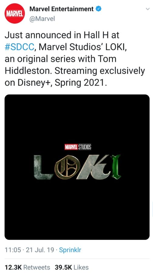

I will concede that using four different fonts is not always the worst possible thing. I’ve seen the ‘intentional clash’ technique work well. But this? This is an assault on the eyeballs. It’s in the uncanny valley between deliberately ugly and accidental disaster. Observe the consistently dark, metallic tone of the first three letters. Then you get to the ‘I’ and it gives you whiplash.
The possibilities of a mini-series from the perspective of the adopted Asgardian god of chaos and mischief are endless. And some of the more enthusiastic Marvel fans have already started to theorise about what the misadventures of their problematic fave might entail. Yet so much of that zeal has been squandered by this ill-conceived branding choice.
The myriad of memes mocking the terrible design hasn’t stopped theorists from A Beautiful Mind-ing the possible meaning behind it, because when it comes to the Marvel Cinematic Universe there has to be some bigger purpose, some grand narrative that we aren’t yet privy to yet… right? One simple explanation is that the god of chaos needs an equally chaotic aesthetic, but I don’t buy that excuse. Loki is more subtle than that, more stylish. He has self-respect. Others reckon that each letter is a very vague clue about the content of the show – Reddit user _pampampampampam suggested that the styles are an allusion to ages in human history, and that there’d be a time travel component to the show.
Though Loki is the most upsetting example, plenty of the revealed logos haven’t fared much better among the critics over on Reddit, with the Hawkeye logo stimulating some especially heated debate. On one hand, it was designed by an actual comic book artist and directly references the source material. On the other hand, it looks like someone took the minimalism movement a little too literally and forgot that this show is part of a multi-billion dollar canon.
There’s still plenty of time between now and the release dates for the logos to be reworked, and no doubt the starving Marvel fans will forgive these slight transgressions when the shows and movies come out. It’s not even that all of the reveals are bad per se, just a little unimaginative. All I’m saying is that for such a huge event like SDCC, you could at least make an effort, Marvel.